Depot signboards
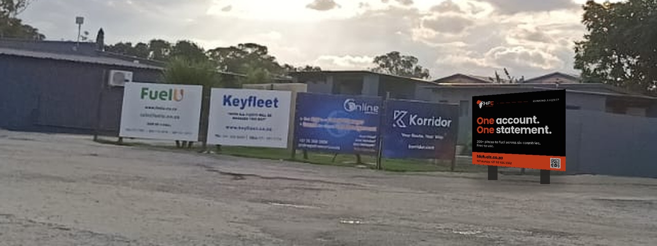
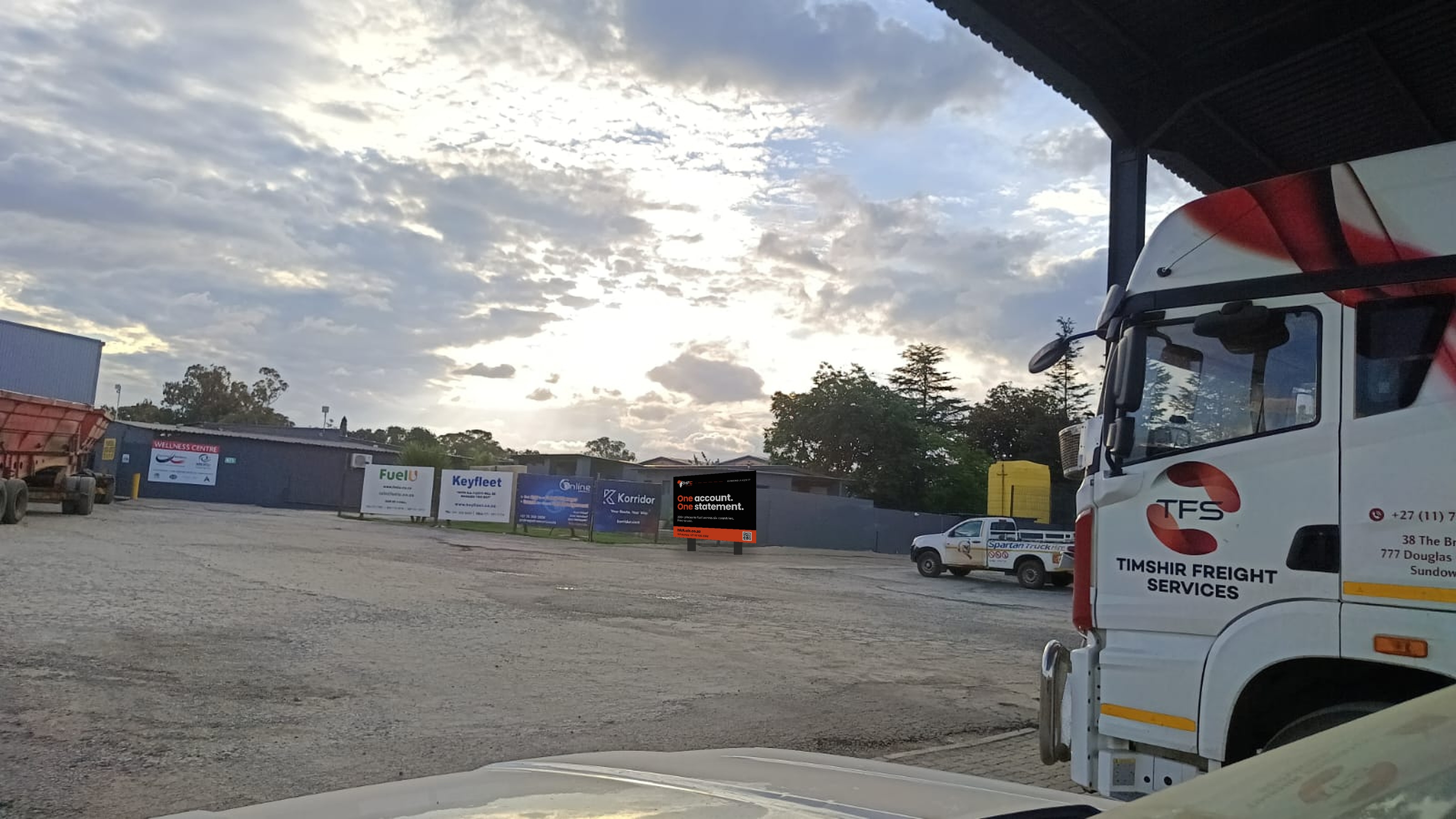
Three options for the sign line at the depot. All three say the same thing, because the photo makes the problem clear: every board on that fence is a logo and a phone number, and from a cab you can read the name and nothing else. These lead with what a fleet owner gets, in type sized to survive the width of the yard.
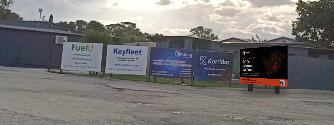
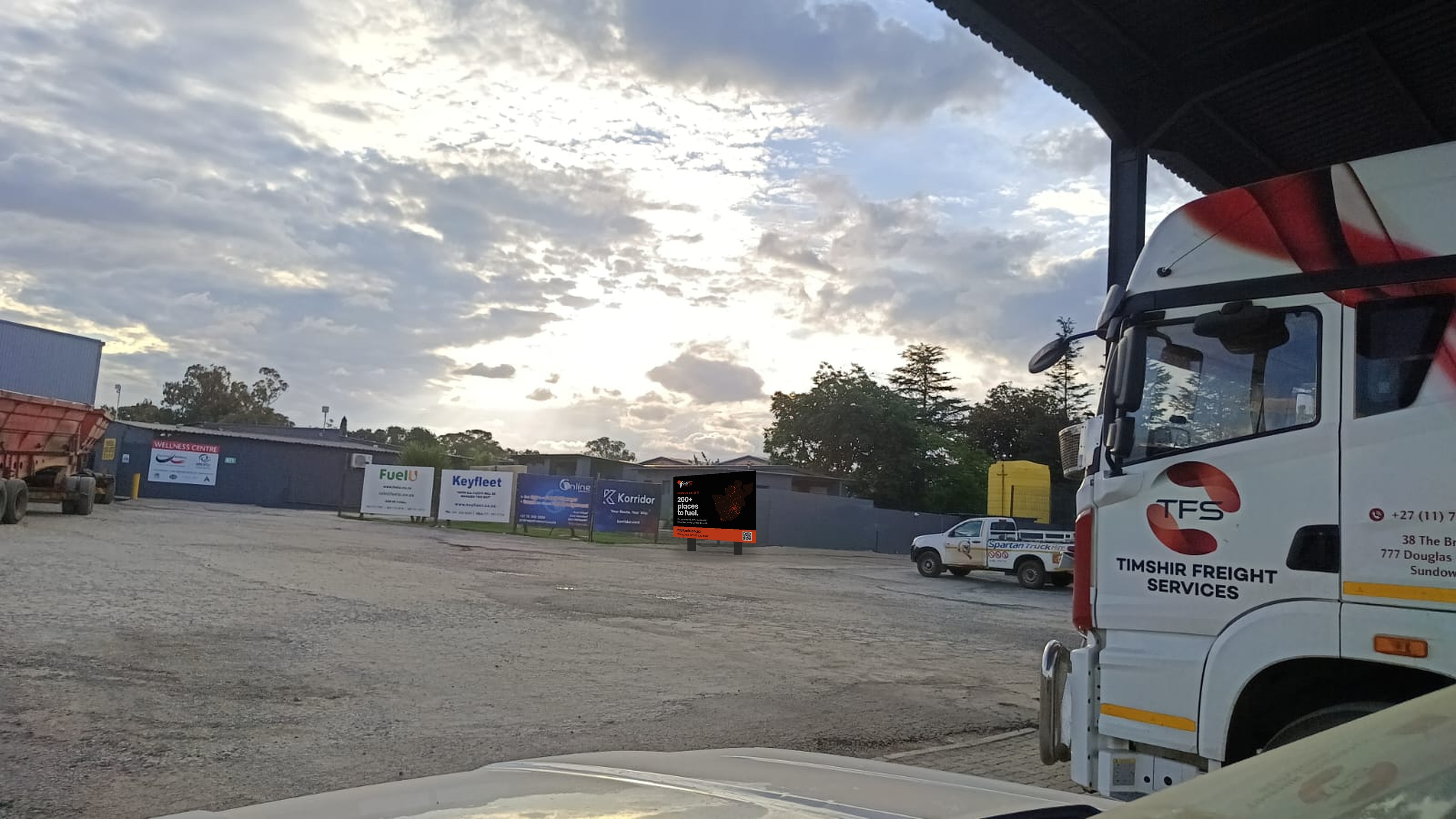
The coverage board
Leads with the thing none of the other four boards on that fence can show: the footprint, drawn from HFC's own live location data. Black against four white and navy panels, so it reads as a different kind of object before a word is decoded. Best if the yard is somewhere drivers stand around.
 Print-ready PDF ↓
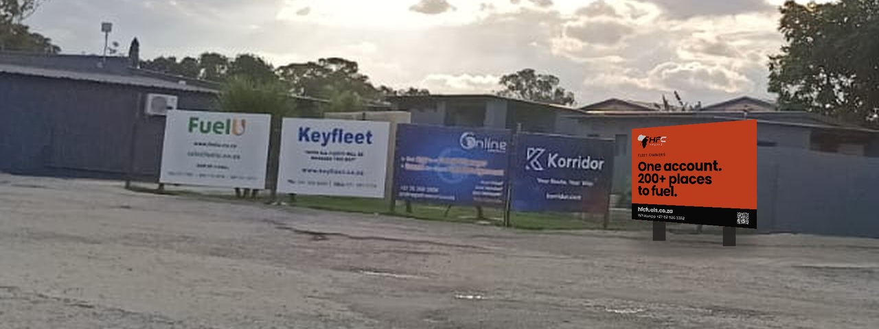
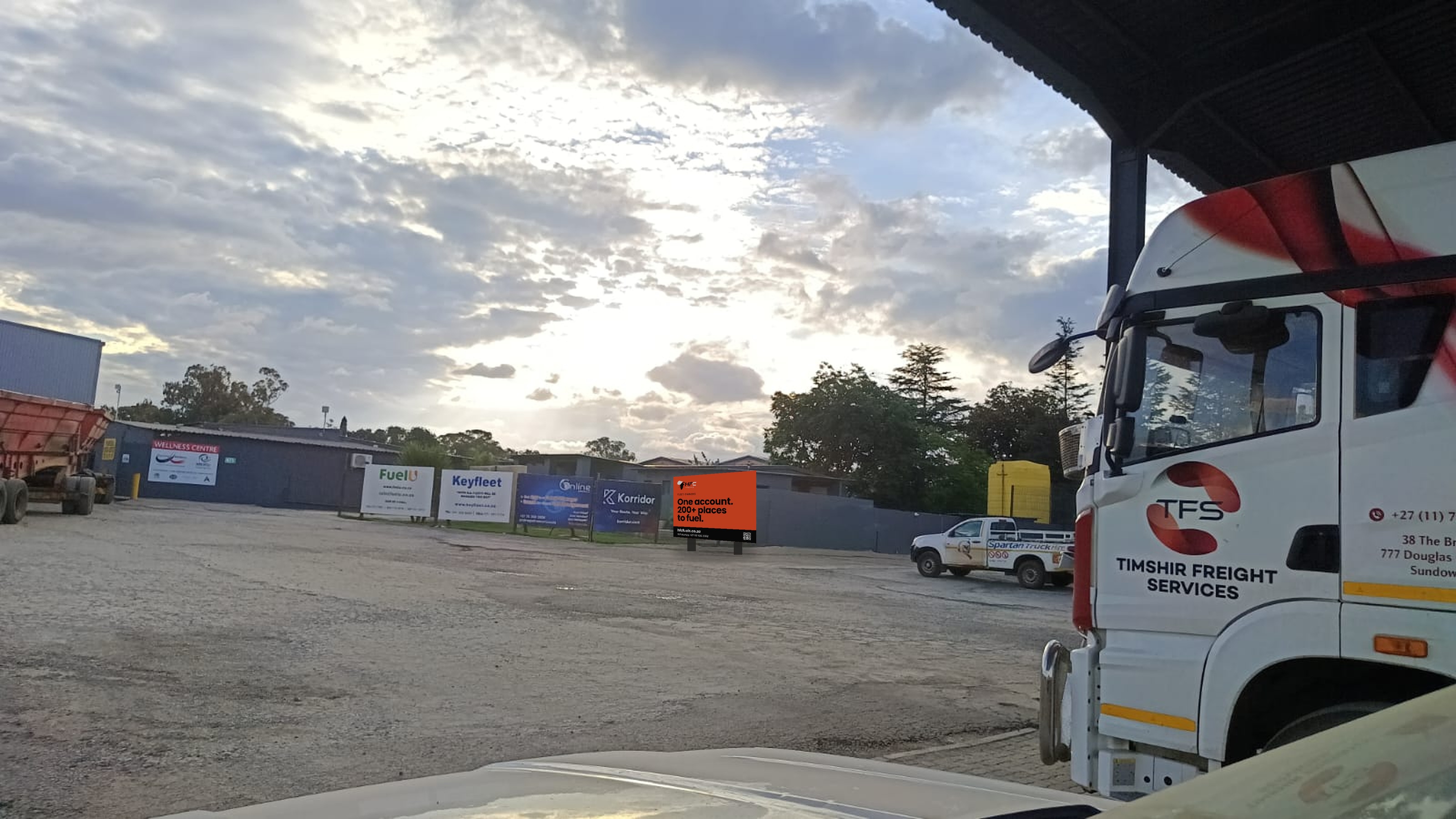
The loud one
Solid orange, black type, five words. The board that wins on pure visibility — it is the only saturated colour field on that fence and the headline still resolves from the far side of the yard. Best if trucks are moving past it.
 Print-ready PDF ↓
The plain-spoken one
No picture at all, so the type is the biggest of the three. States the whole offer in four words and lets the coverage claim sit underneath. Best if the board ends up further back or partly blocked by parked trucks.
 Print-ready PDF ↓
- Artwork is 1200 × 900 mm with 10 mm bleed all round.
- It is true vector, so the same PDF prints at any size — if the frame turns out bigger, scale it, don't re-make it.
- Nothing that has to be read sits in the outer 60 mm, and the contact strip is a full-width 160 mm band, so trimming a few millimetres costs nothing.
- Suggested finish: single-sided print on 3 mm ACM or Chromadek, on two posts, matching the panels already on that fence.
- The QR goes straight to a WhatsApp message to HFC, already written.